Impact
Efficiency
Accelerated design and engineering velocity by overhauling the design system and reducing technical debt.
Retention
Conversion
Context
In 2024, Kajabi undertook a full-scale rebrand. This wasn’t just a facelift, it was a strategic shift aimed at expanding our brand’s appeal, reinforcing trust and credibility, and ensuring a seamless, high-quality experience across all touchpoints.
We partnered with Gretel and Fuzzco to craft this new identity. While the marketing site and brand visuals were undergoing a transformation, the core experience our customers rely on daily needed to evolve alongside it.
That’s where I came in.
With an ambitious launch date set for early October, we had just over three months to take the brand refresh from a Figma file to a fully integrated, production-ready experience inside the Kajabi platform. No pressure.
My role
Owning all product design & design system work
Defining the phases of product & engineering implementation
Collaborating closely with product, engineering, brand, and senior leadership to ensure alignment
Delivering a cohesive, refreshed experience across the entire Kajabi platform
A design language with purpose
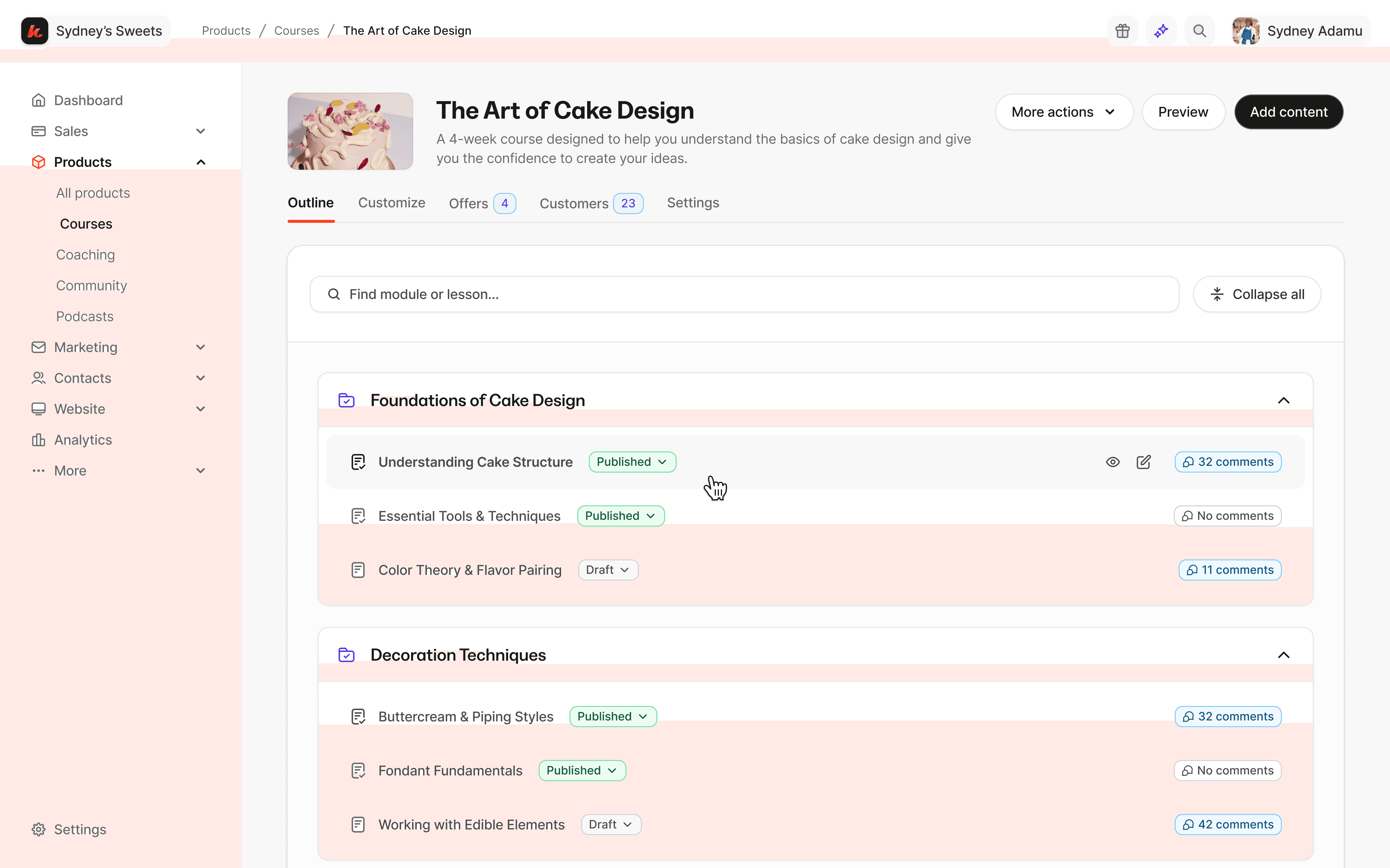
I led the effort to redefine Kajabi’s design language by translating the refreshed brand identity into a functional and scalable system for product. I extended the visual style guide into UI patterns that prioritize clarity, efficiency, and momentum for creators.
We restructured layouts to make better use of space, especially in data-dense areas like dashboards, allowing for faster scanning and more confident decision-making.
I refined iconography and removed redundant copy to create more action-forward interfaces. Motion, depth, and color were used with intent to signal interactivity, guide flow, and create a responsive feel without adding friction.


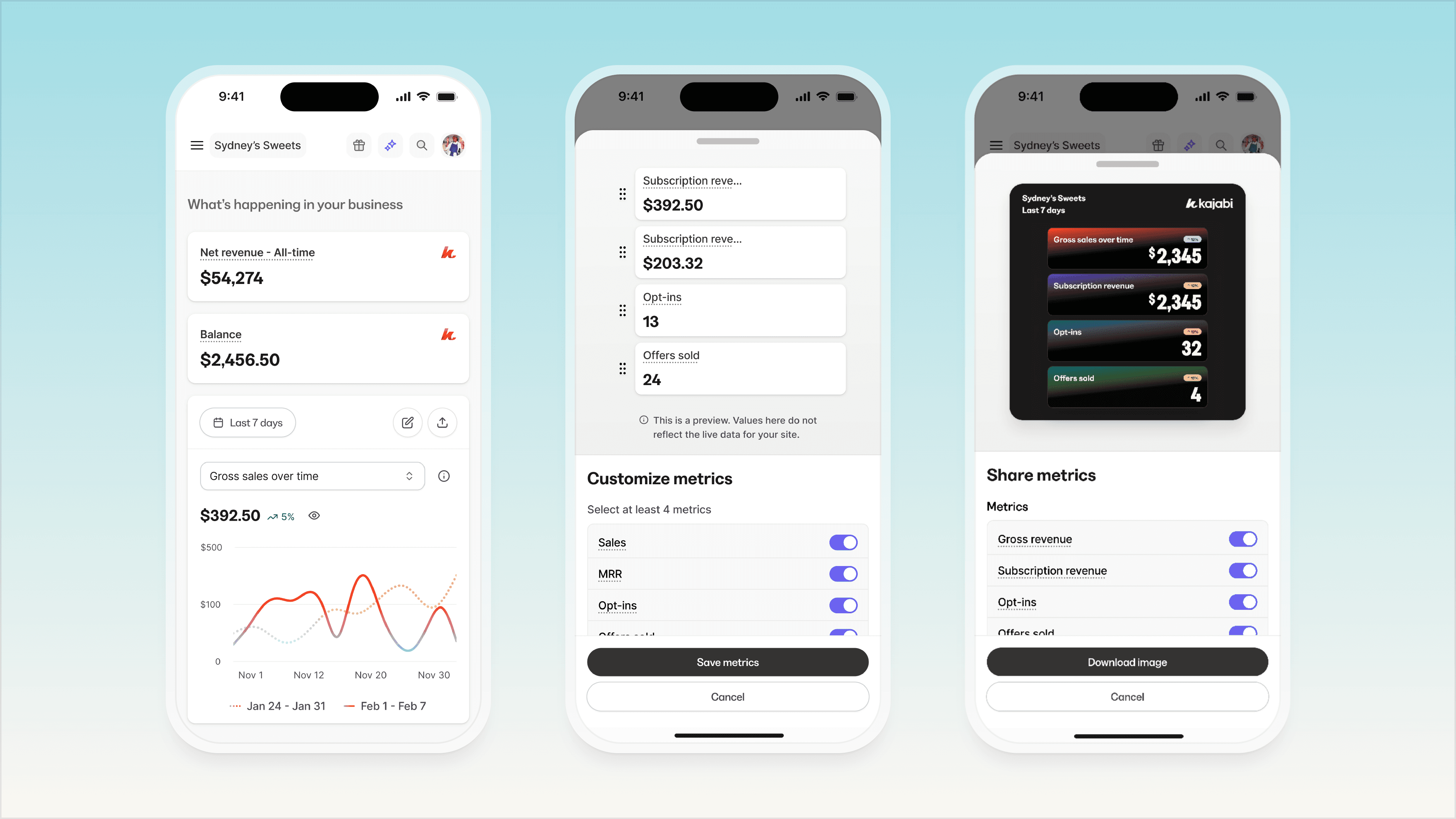
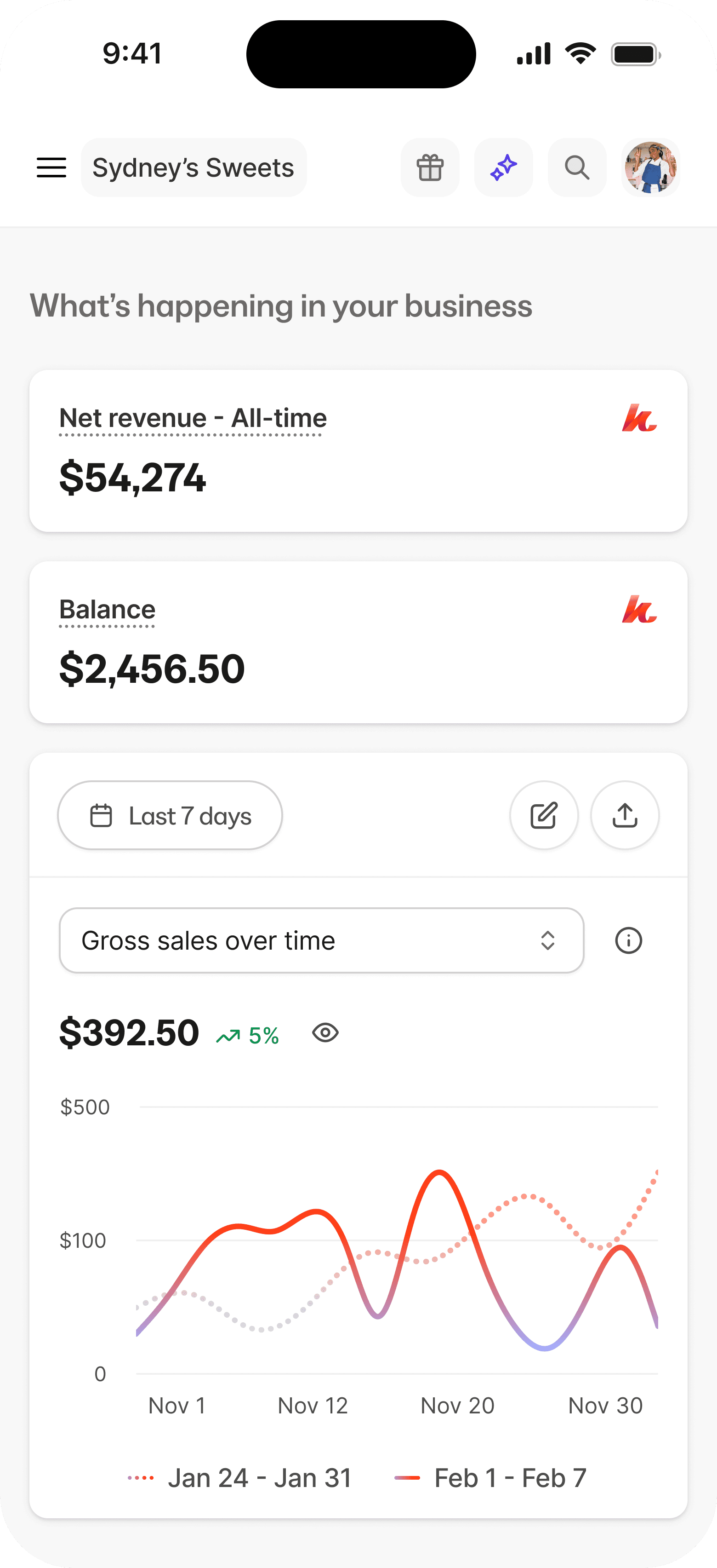
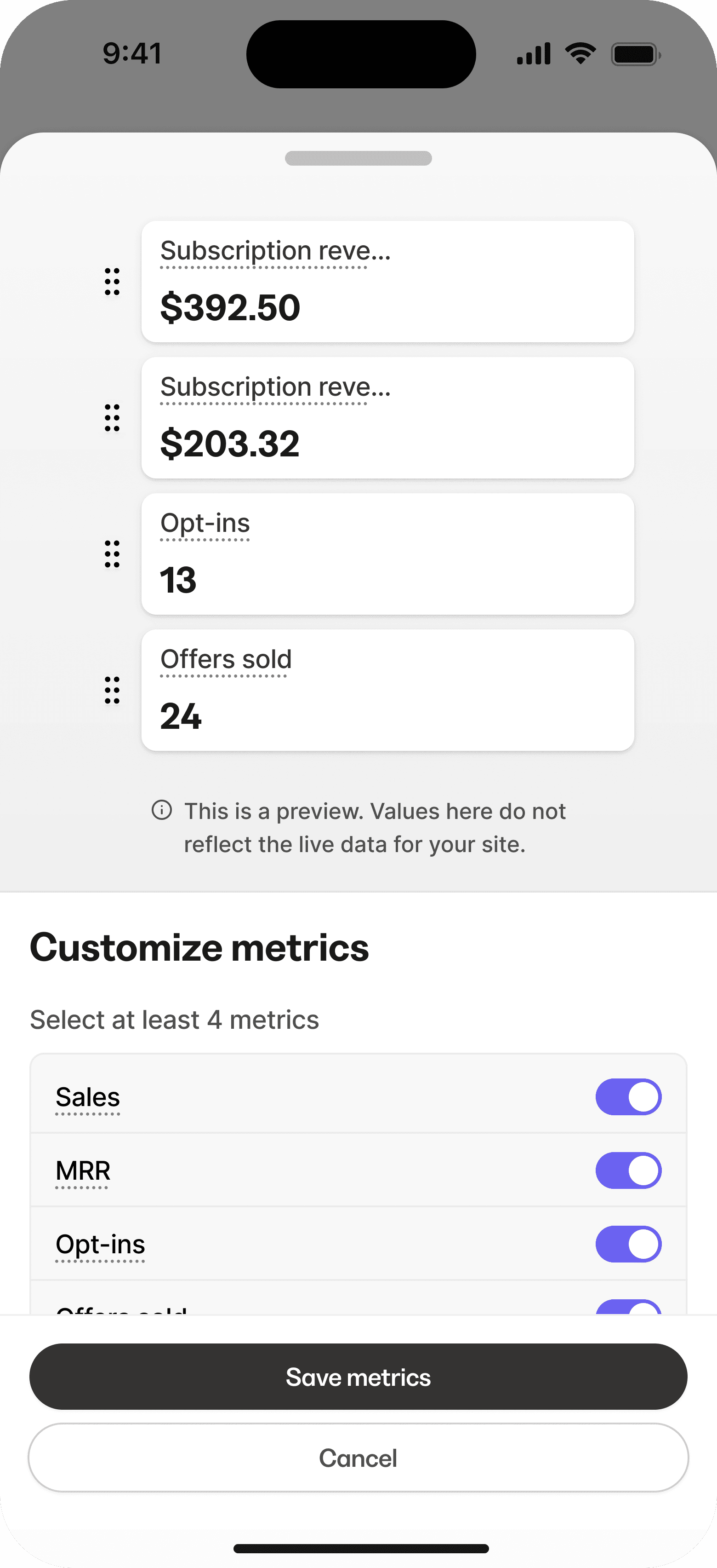
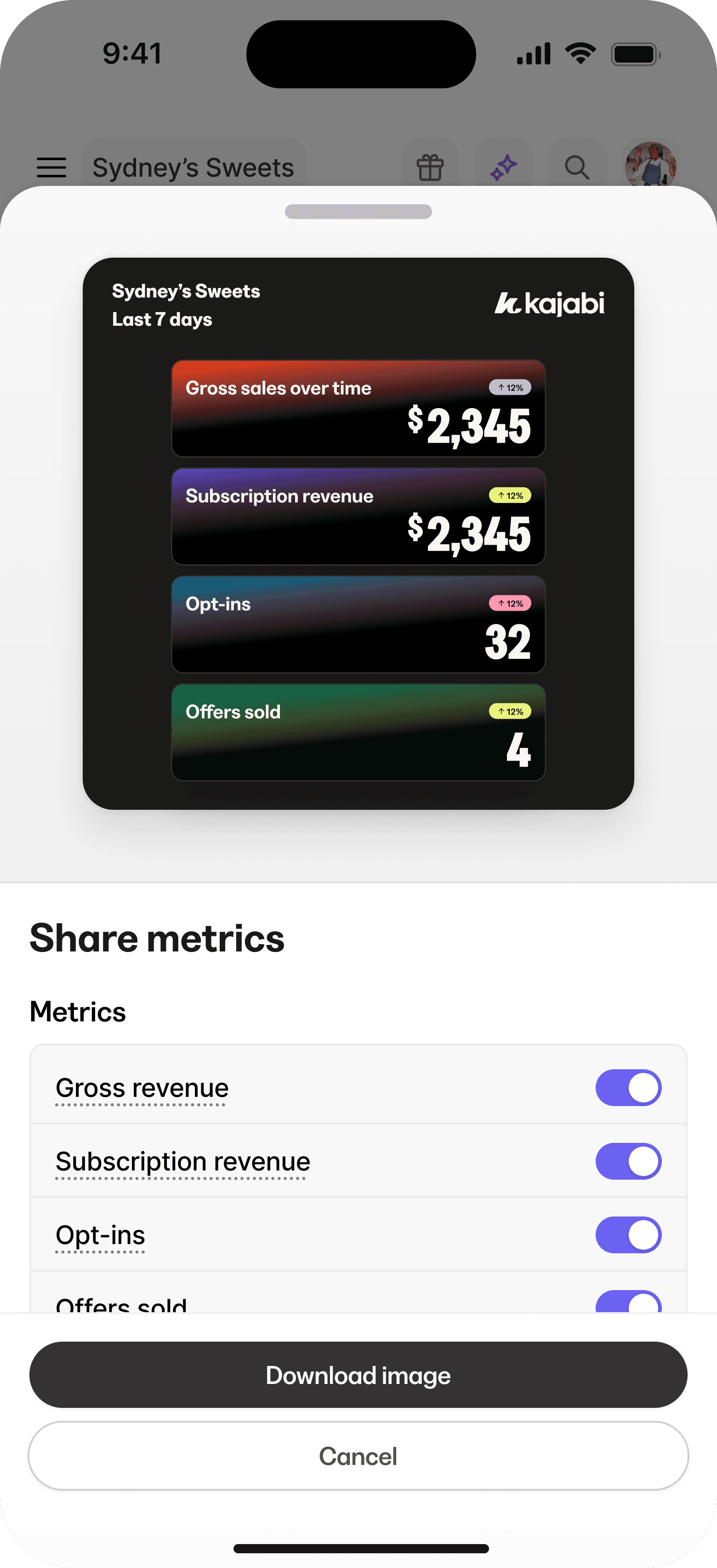
A dashboard that actually matters
A novel idea, huh? The main dashboard in Kajabi hadn't been touched in nearly 7 years (I know, lol). This surface became a proving ground for the new design language. We replaced the static, low-value experience with a dynamic, data-driven overview tailored to what creators actually care about: revenue trends, product performance, and subscriber growth.
The new layout makes better use of space, surfaces key insights at a glance, and gives users immediate access to deeper metrics. Every element reflects the updated design language: cleaner typography for scannability, purposeful use of color to guide attention, and subtle motion to create a sense of responsiveness. It turned the dashboard from a placeholder into a functional, high-signal hub for running a business.
Kathy Keats
Lauren Goldstein
Momentum from the first click
Jackson Combs
Final thoughts

Special thanks
Though I focused on my role in the story, this wouldn’t have been possible without the talented UX team by my side. A heartfelt thanks to my collaborators and fellow builders. Roll the credits: Monica Wheeler, Court McFadzean, Julian Skinner, Phillip Lovelace, Chris Chung, Ashley Echols, Quinton Jason, Matt Patterson, Heather Haselwood, Gabriel Tayag, Christine Sun, Amy Lu